GIS – Mirroring the COVID-19 Spread
The other day, I overheard two primary school students on their bicycles. The conversation was like this – ‘no we cannot go on this road, my dad showed me a drawing which said Corona is here. Arre yaar, it’s not a drawing it’s a map’.
Maps and Covid19, has kept the world busy since November 2019. They are probably the only set of maps that are being updated daily. The maps and the associated data are the elementary components of the underlying platform being used, the Geographical Information System (GIS). GIS is no more a back-office tool. When it comes to visualizing and interpretation of data all roads lead to GIS technology. They say a picture is more than a thousand words; but I would say that a map is more than a thousand pictures.
Change is perennial, and maps are the best form of depicting change. The world is dynamic, and it can be hard to keep up with changes in your city and neighborhood. GIS is omnipresent and is extensively used in most situations; from pandemics to elections, surveying to navigation, natural disasters to human race mapping; it is in fact all pervading.
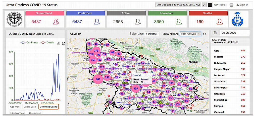
If we think about the maximal usage of GIS in the past one year, it has been in mapping the pandemic. Giving as much information as possible to health workers, security authorities, business houses and the common man. Let’s begin with the global mapping of the Corona prevalence of the World Health Organization. What does a layman understand from this; number of cases in each country? Yes, but he is automatically drawn to the yellow coloured polygon and clicking on it is the surprising information that Turkmenistan has no cases from January3, 2020 till date! Coming to map of India, state wise distribution of cases is available. But still these maps are not giving what the person who has locked himself/herself at home wants.
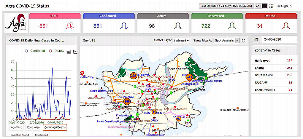
During the pandemic what every citizen looks for is where will I get my groceries, where will I get my daily essentials, which areas around my home are under quarantine, which areas are under total lockdown, where are the Covid19 testing facilities, which hospitals are equipped with ICUs, which hospitals have ICU vacancies, every thought is about WHERE will I get anything? The preparation of these maps is carried out on IGiS platform. The maps include location of hospitals with vacancies, location of testing facilities, special food shelters, availability of daily essentials, quarantined areas and so on. The level of details in the maps is only limited by the details provided by the city administration Once the maps are ready they are published on the portal and made accessible to all citizens.
Another feature provided for the authorities is tracking of an infected person who is quarantined at home using a mobile app. Here a combination of face recognition and GPS is used to create a virtual geo-fence. The mobile number of the patient is logged into the database. A circle of 10 m radius is defined as the geo-fence for the patient. Every time the patient crosses this fence an alert is generated which goes to the patient as well as the Administration.
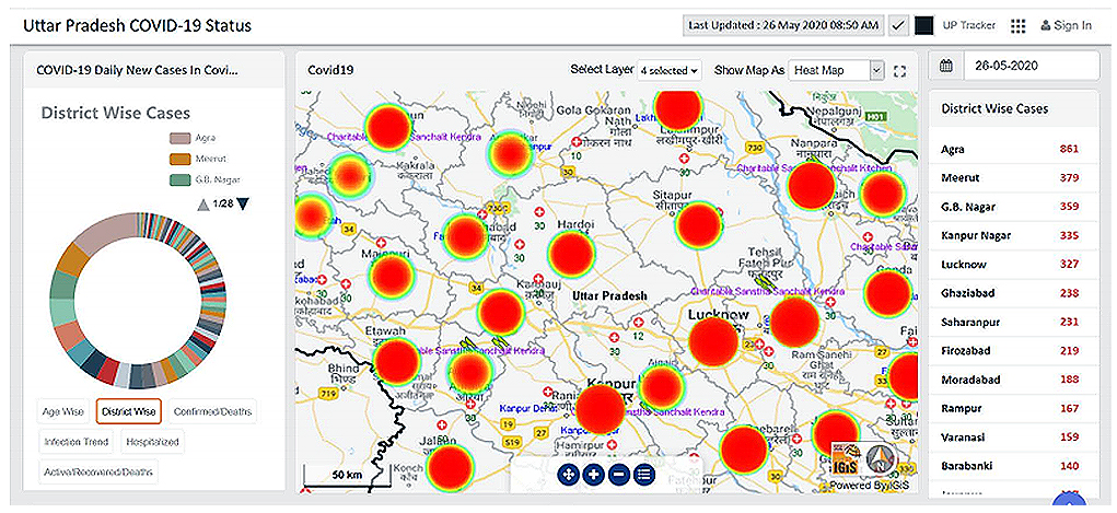
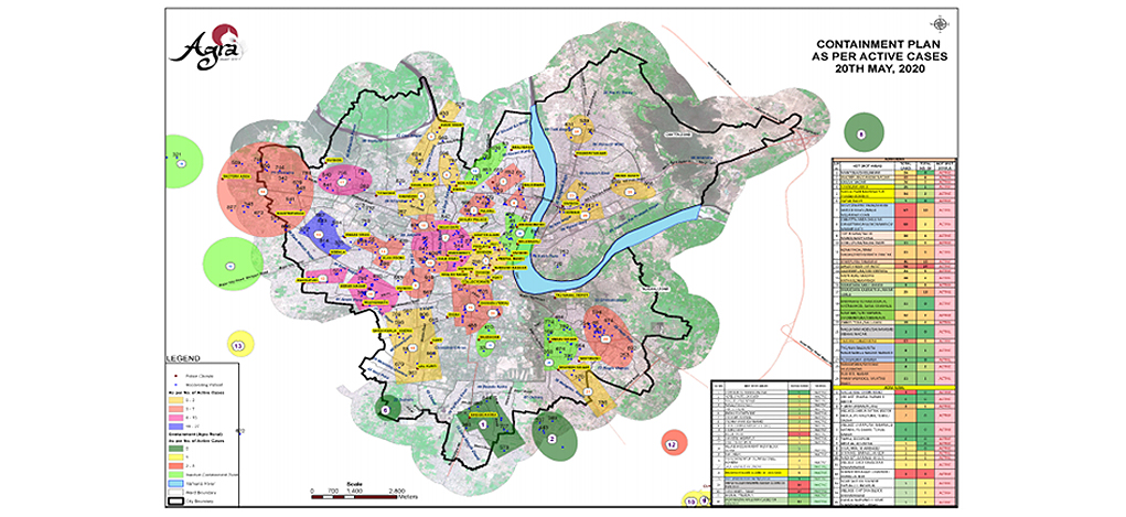
All aspects related to Covid19 suspect quarantined cases, and patients are made available centrally for better planning and monitoring. GIS-based analysis like heat maps and cluster analysis help in mitigation of spread of the disease. Time series-based analytics are provided to understand trends and get insights for targeted interventions and actions. The epicenter mapping helps in identifying the source for containing the spread. Real time demarcation of containment zones is provided for planning entry and exit restrictions.
Containment zones displayed through maps improves citizen awareness and enable geospatial analysis. E.g. What is the size of the population in the containment zone, what areas need to be extensively sanitized and which areas should be avoided. Better resources management is supported through mapping of Response Capacity and Infrastructure. Web enabled centralised GIS application with dashboard ensures correct information is available at a mouse click, thereby quelling all kinds of rumours.
We at Scanpoint Geomatics Limited provided answers to such questions (Lucknow, Uttar Pradesh & Agra) through a quick deployment of web portals on IGiS platform with all the GIS data at the backend for 25 + cities.
Latest Blog
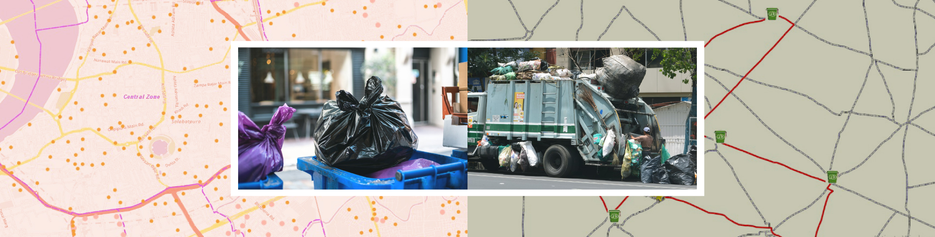
Smart Waste Management with GIS
1. Introduction: Waste management entails the responsible collection, processing, and disposal of waste materials with a focus on environmental preservation. Its core objectives include waste reduction, resource recovery, and the....
Read More